Note
Go to the end to download the full example code. or to run this example in your browser via Binder
Boxplot#
Shows the use of the functional Boxplot applied to the Canadian Weather dataset.
# Author: Amanda Hernando Bernabé
# License: MIT

# sphinx_gallery_thumbnail_number = 2
First, the Canadian Weather dataset is downloaded from the package ‘fda’ in CRAN. It contains a FDataGrid with daily temperatures and precipitations, that is, it has a 2-dimensional image. We are interested only in the daily average temperatures, so we will use the first coordinate.
from skfda.datasets import fetch_weather

X, y = fetch_weather(return_X_y=True, as_frame=True)
fd = X.iloc[:, 0].array
target = y.array
fd_temperatures = fd.coordinates[0]
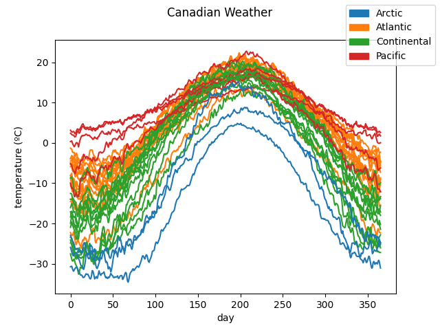
The data is plotted to show the curves we are working with. They are divided according to the target. In this case, it includes the different climates to which the weather stations belong to.
# Each climate is assigned a color. Defaults to grey.
import matplotlib.pyplot as plt

label_names = target.categories

fd_temperatures.plot(
    group=target.codes,
    group_names=label_names,
)
plt.show()
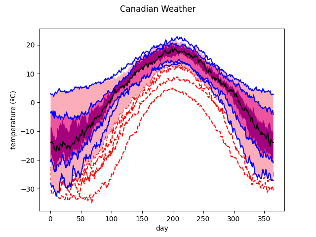
We instantiate a Boxplot
object with the data, and we call its
plot() function to show the
graph.
By default, only the part of the outlier curves which falls out of the
central regions is plotted. We want the entire curve to be shown, that is
why the show_full_outliers parameter is set to True.
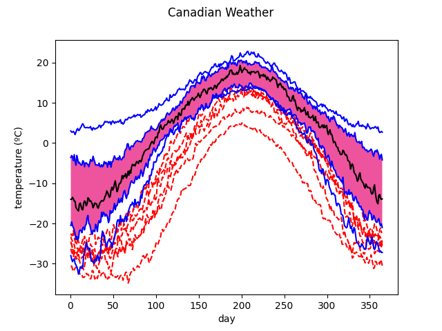
We can observe in the boxplot the median in black, the central region (where the 50% of the most centered samples reside) in pink and the envelopes and vertical lines in blue. The outliers detected, those samples with at least a point outside the outlying envelope, are represented with a red dashed line. The colors can be customized.
The outliers are shown below with respect to the other samples.
color = 0.3
outliercol = 0.7

fd_temperatures.plot(
    group=boxplot.outliers.astype(int),
    group_names=["nonoutliers", "outliers"],
)
plt.show()
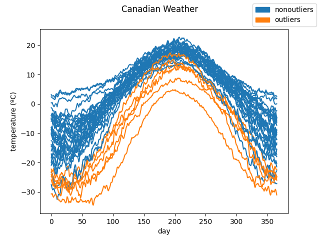
The curves pointed as outliers are are those curves with significantly lower
values than the rest. This is the expected result due to the depth measure
used, IntegratedDepth(), which ranks
the samples according to their magnitude.
The Boxplot object admits any
depth measure defined or customized by the user. Now
the call is done with the ModifiedBandDepth
and the factor is reduced in order to designate some samples as outliers
(otherwise, with this measure and the default factor, none of the curves are
pointed out as outliers). We can see that the outliers detected belong to
the Pacific and Arctic climates which are less common to find in Canada. As
a consequence, this measure detects better shape outliers compared to the
previous one.
from skfda.exploratory.depth import ModifiedBandDepth

boxplot = Boxplot(
    fd_temperatures,
    depth_method=ModifiedBandDepth(),
    factor=0.4,
)
boxplot.show_full_outliers = True

boxplot.plot()
plt.show()
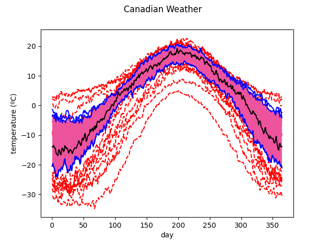
Another functionality implemented in this object is the enhanced functional boxplot, which can include other central regions, apart from the central or 50% one.
In the following instantiation, the
IntegratedDepth() is used and the 25% and
75% central regions are specified.
from skfda.exploratory.depth import IntegratedDepth

boxplot = Boxplot(
    fd_temperatures,
    depth_method=IntegratedDepth(),
    prob=[0.75, 0.5, 0.25],
)
boxplot.plot()
plt.show()
The above two lines could be replaced just by boxplot inside a notebook
since the default representation of the
Boxplot is the image of the plot.
Total running time of the script: (0 minutes 0.374 seconds)